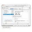
Sizzy: Responsive Design Simulation Tool
Sizzy is a utility tool designed specifically for web developers and designers who need to test responsive designs across various devices. It allows users to view their projects on multiple screen sizes simultaneously, providing a clear representation of how a website will appear on different devices. With its intuitive interface, Sizzy simplifies the process of ensuring that web applications are optimized for mobile, tablet, and desktop views.
One of the main features of Sizzy is its ability to simulate real device environments, including specific operating systems and resolutions. This functionality enables users to identify and resolve layout issues promptly. Additionally, Sizzy offers tools for inspecting elements and testing media queries, making it an essential asset for anyone involved in web design and development.